Nature-inspired, earthy, textural
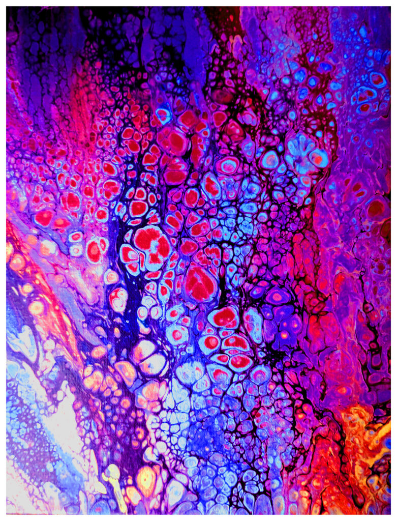
“Lower the Heavens”
16×20″ Acrylic on Stretched Canvas
$100
Lower the Heavens is a painting about the sky coming down to meet you — not as catastrophe, but as gift. Named for the luminous song by The Donkeys, it carries that same quality of dreamy, slightly overwhelmed wonder, the feeling of beauty arriving in quantities that exceed what you were prepared to receive.
The canvas is an eruption of magenta, fuchsia, crimson, and violet — colors that don’t exist in nature so much as in the heightened reality of dreams and peak experiences, the palette of a sky that has decided to stop being distant and get personal. Thousands of cellular forms cluster and bloom across the surface like some ecstatic organism reproducing at the speed of joy, each one rimmed in black that keeps the whole magnificent chaos from dissolving into pure light.
Lower the Heavens does not depict a quiet spiritual moment. It depicts the moment after you asked for something extraordinary and the universe said yes.
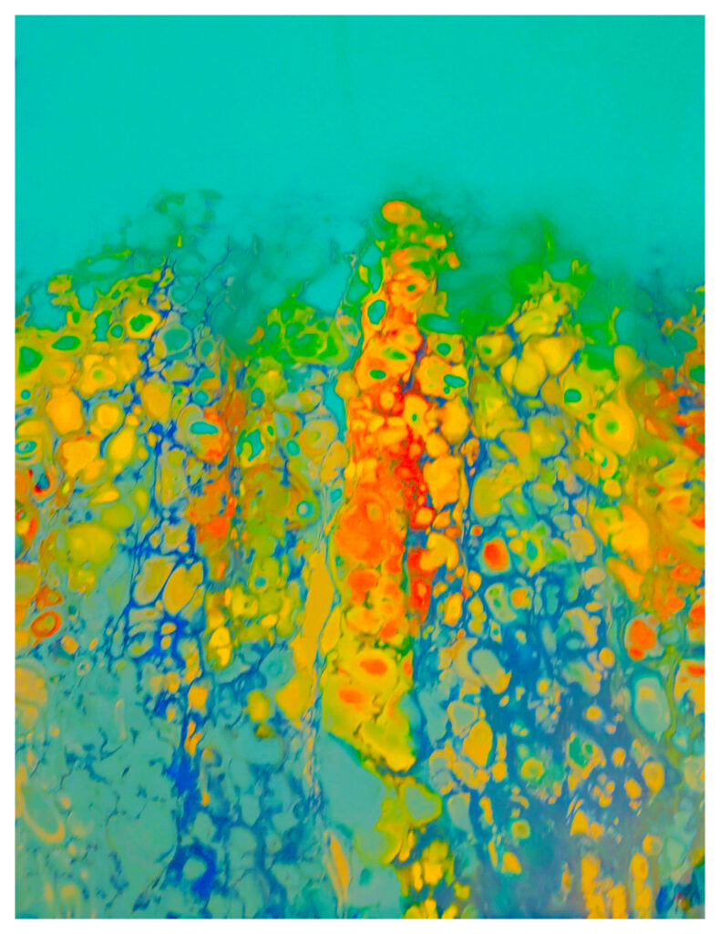
“Roman Holiday”
16×20″ Acrylic on Stretched Canvas
SOLD
Roman Holiday arrives like the song it’s named for — bright, restless, and shot through with a kind of beauty that has an edge to it, joy that knows its own expiration date. Fontaines D.C.’s track crackles with the particular energy of people fully alive in a moment, drinking it down before it’s gone, and this painting lives in exactly that register.
Against a vast, luminous expanse of pure cerulean — open sky, Mediterranean sea, the particular blue of a city that has been beautiful for so long it wears it casually — a skyline of organic forms rises in gold, yellow, chartreuse, and molten orange, their edges bubbling and cellular, like ancient stone seen through heat shimmer or the distortion of too much sun and too much wine and too much afternoon. At the composition’s center, a column of deep red-orange burns upward like a torch, like the heart of the revelry, like the thing everyone at the party is pretending not to notice is also a warning.
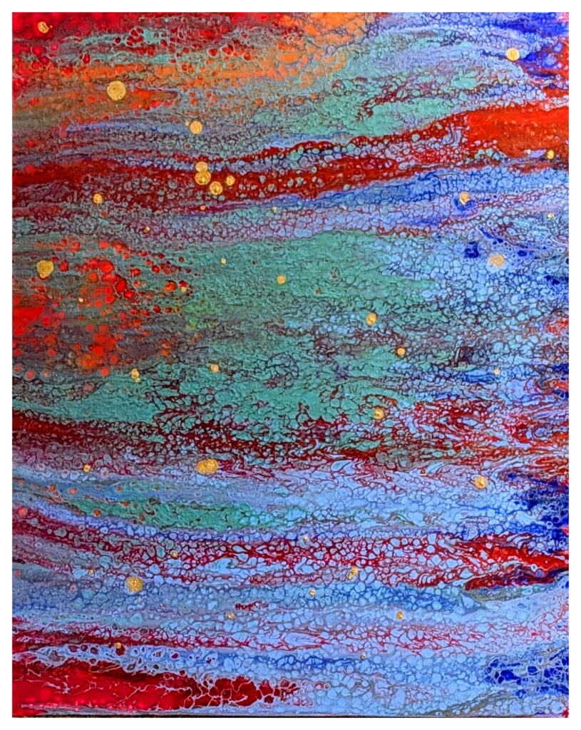
“From the Edge of the Deep Green Sea”
24×30″ Acrylic on Wide Profile Stretched Canvas
On Exhibition
From the Edge of the Deep Green Sea borrows its title from one of The Cure’s most sweeping and emotionally devastating songs — a nearly nine-minute tide of longing, beauty, and irreversible loss. The painting honors that source with the full seriousness it deserves, translating sound into surface with remarkable fidelity of feeling if not of form.
Horizontal bands of seafoam, jade, and deep teal roll across the canvas like swells on an open ocean, threaded through with currents of crimson and burgundy that pulse beneath the surface like something unresolved, something that won’t quite heal.
The gold flecks scattered throughout are the painting’s most quietly devastating detail — catching light like bioluminescence, like the small luminous moments that make loss so unbearable precisely because they confirm what was real and what is now gone. They do not comfort so much as bear witness. Robert Smith once described the song as being about a perfect moment that cannot be held. From the Edge of the Deep Green Sea understands that perfectly — it is a painting you can see entirely and still never quite reach.
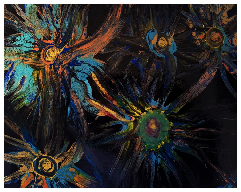
“Girasole”
24×30″ Acrylic on Wide Profile Stretched Canvas
$200
Named for the Italian word for sunflower, Girasole reimagines the familiar bloom as something ancient, electric, and alive with hidden energy. Against a deep, velvety black ground, four flower forms emerge — not as gentle garden subjects, but as radiant, almost cosmic forces, their petals rendered as sweeping dark striations that pulse outward like solar flares or the spokes of a great wheel set in motion.
At the heart of each bloom glows a luminous golden center, spiraling inward with hypnotic precision. Threads of teal, turquoise, copper, and cobalt weave through the composition, lending each flower a bioluminescent quality — as though these are not plants rooted in earth, but organisms thriving in some deeper, darker medium: ocean floor, night sky, or the fertile darkness of the unconscious mind.
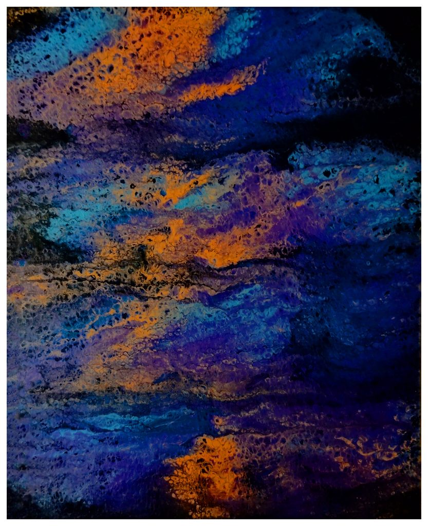
“Dark Don’t Hide It”
12×16″ Acrylic on Stretched Canvas
$75
Dark Don’t Hide It is a painting about visibility — about the things that glow precisely because of, not despite, the darkness that surrounds them. From a ground of deep, consuming black, waves of cobalt, sapphire, and violet surge and crest, threaded through with veins of molten amber and gold that refuse to be swallowed.
The darkness here is not absence. It is presence — a rich, velvety weight that gives every other color its full power. The title carries the cadence of a directive, a piece of hard-won wisdom passed between people who know what it is to carry something heavy. Don’t hide it. Let it be seen. And the painting embodies exactly that philosophy — nothing here is softened or made palatable. The blacks are absolute, the oranges volcanic, the blues oceanic in their depth and indifference.
Dark Don’t Hide It is a painting that understands grief and resilience as two expressions of the same fierce honesty — and asks us to hold both without looking away.